- UI Design
- Research
- Web Application
- Financial Data
NASA ProSAMS
2022-2024
Brought a legacy product for NASA into a more modern framework and design, laying the groundwork for a larger modernization effort alongside a cross-functional team.
Background
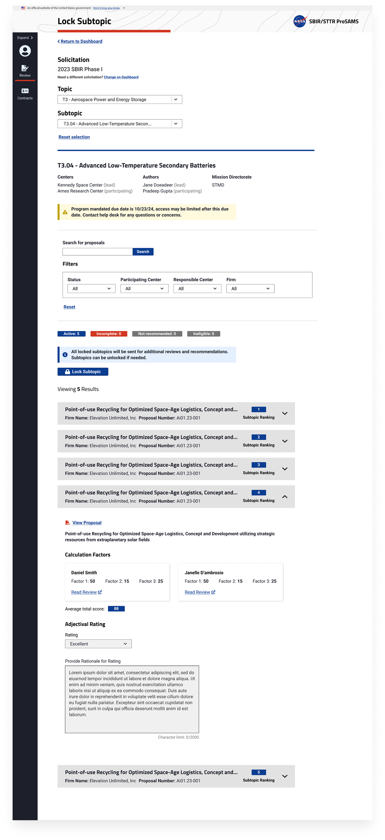
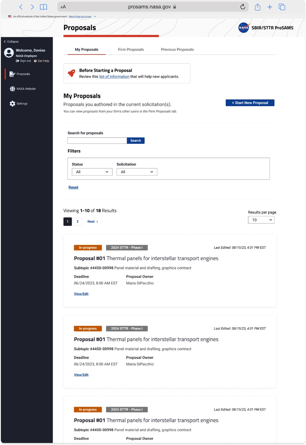
ProSAMS is responsible for distributing around $150 million each year to over 300 different applicants and is the software that manages the proposal review process. The program ultimately aims to advance America’s space technology competitiveness by giving small businesses access to funding.
Successes
We launched this new product within a major award cycle and it was noted that less non-compliant funding proposals were being submitted by firms than in the past, which saved NASA both time and employee bandwidth during the proposal review process. Review cycle timeframes also improved compared to the former system, and there was a significant cost savings in moving the system to a more lean, modern framework.
Design Process
Discovery
Starting from scratch with a UX researcher, we got to interview scientists, policy-makers, and engineers at the forefront of NASA’s technology infrastructure. These were folks who had received awards in the past, and NASA employees who were experts in the program’s successes and current needs. The current web application, EHB, was over 30 years old and in desperate need for improvements.
Findings
Users felt like they spent too much time in the current EHB filling out applications because the system didn’t break things down into smaller steps.
Fearing data loss, a lot of users ended up working on their tasks in Word or outside software, then copying/pasting into the EHB.
We had to build for data integrity and user convenience in the new system, while not breaking the application’s flow that was mirroring policy requirements from the federal government.
Ideation
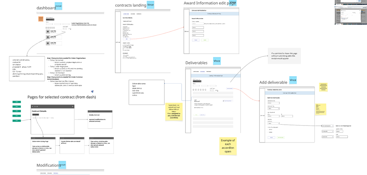
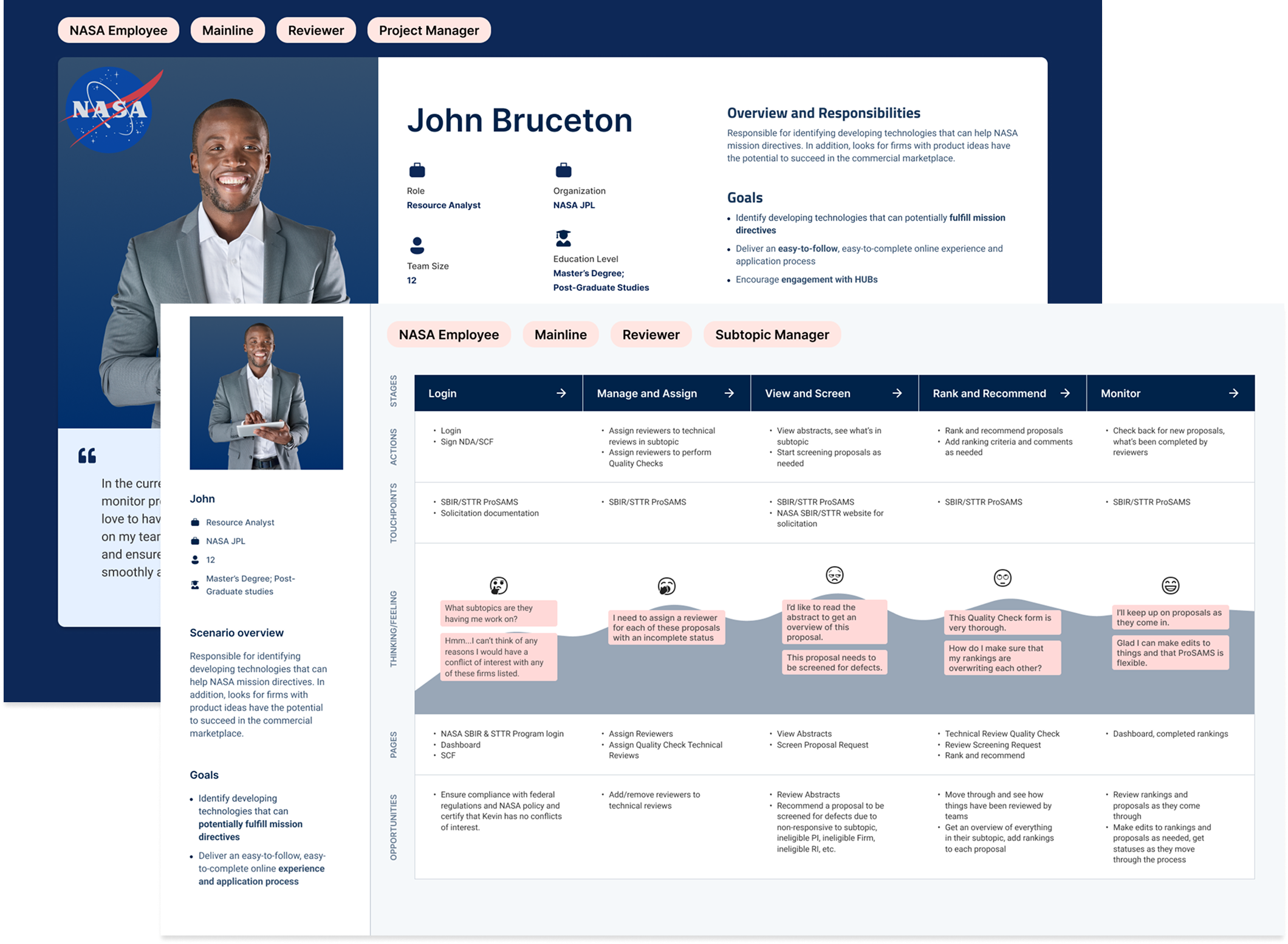
We drew up user personas and journey maps during each sprint before any mockups were made so that we had our target users in mind. This exercise also helped business analysts and engineers see that user needs were more than just a refreshed UI - these were people with a decent amount of technical experience but had frustration with the status quo. Our BAs were utilized for their in-depth product knowledge that helped us envision the roadmap for new features, and what to design based on their success criteria.
Findings
In the midst of getting a feel for the future of the ProSAMS interface and user journey, the client changed the framework they wanted to use from Angular to React.
We identified potential design constraints early on with the team’s technical lead by including them in on our design whiteboarding sessions, and then adjusting our expectations before we sunk any time into prototypes.
Design
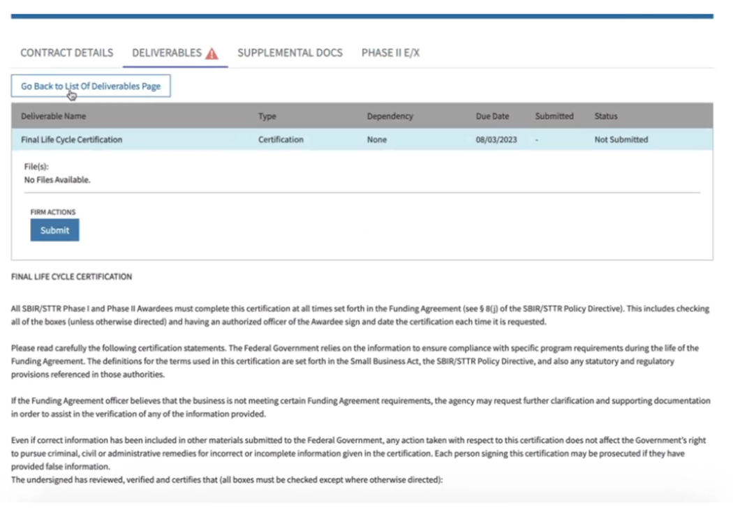
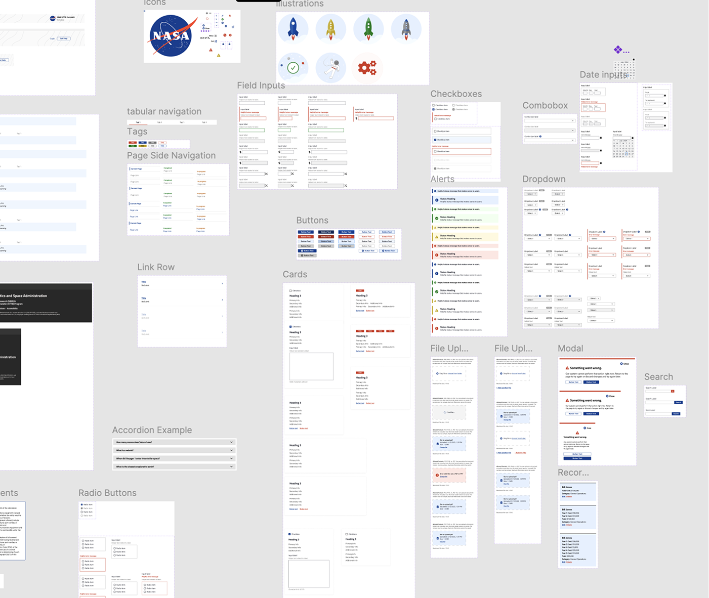
There was going to be a lot of screens for each release. Our product managers had to adjust release timelines based on client expectations. Therefore, a simple, re-usable design system that focused on the essential form elements and could be broken down easily for mobile would be our best bet. We on-boarded the new developers to the U.S. Web Design System (USWDS), showing how a lot of elements were already built out and could easily be blended in with the layout customizations for ProSAMS.
Findings
NASA didn’t have an official web design standards document when we started.
We did an analysis of their other websites and matched both the typography and color palette while mimicking some of their pre-existing print graphics standards.
Working with another designer, we came up with a division of workload while agreeing on layout, navigation, and other component standardizations.
Aesthetics needed to be kept minimal to focus on meeting user expectations for data collection and NASA policies around SBIR-STTR data collection.