- UI Design
- Web Application
- Drupal
Govinfo.gov
2019-2021
Took a Congressional records research and data storage product from an initial launch into it's next iterations based on the client's vision.
Background
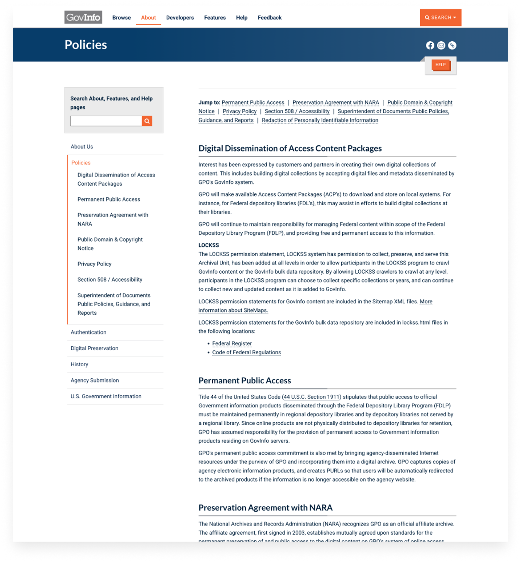
One of the U.S. Government’s official repositories for regulatory and agency data, Govinfo was in need of further enhancements that didn’t make it in the initial launch.
Successes
Arriving at the project after a period where they didn’t have design resource allocations, I took charge to reduce the project backlog and maintain a quick turnaround on new front-end features. This helped the client push out new features on time and freed up developer allocation because I could contribute front-end code. The site now has improved page metadata, appears frequently in organic searches, and integrates better with library research tools.
Design Process
Discovery
The client had a rough roadmap for enhancements to take the initial MVP further, but didn’t know what to prioritize or how to incorporate user feedback into decisions.
I reviewed their backlog and used research data from the previous UX designer, then took feedback from their help desk and training sessions to figure out the best next steps. This involved discovery meetings, while also getting a feel for the client and team dynamic.
Findings
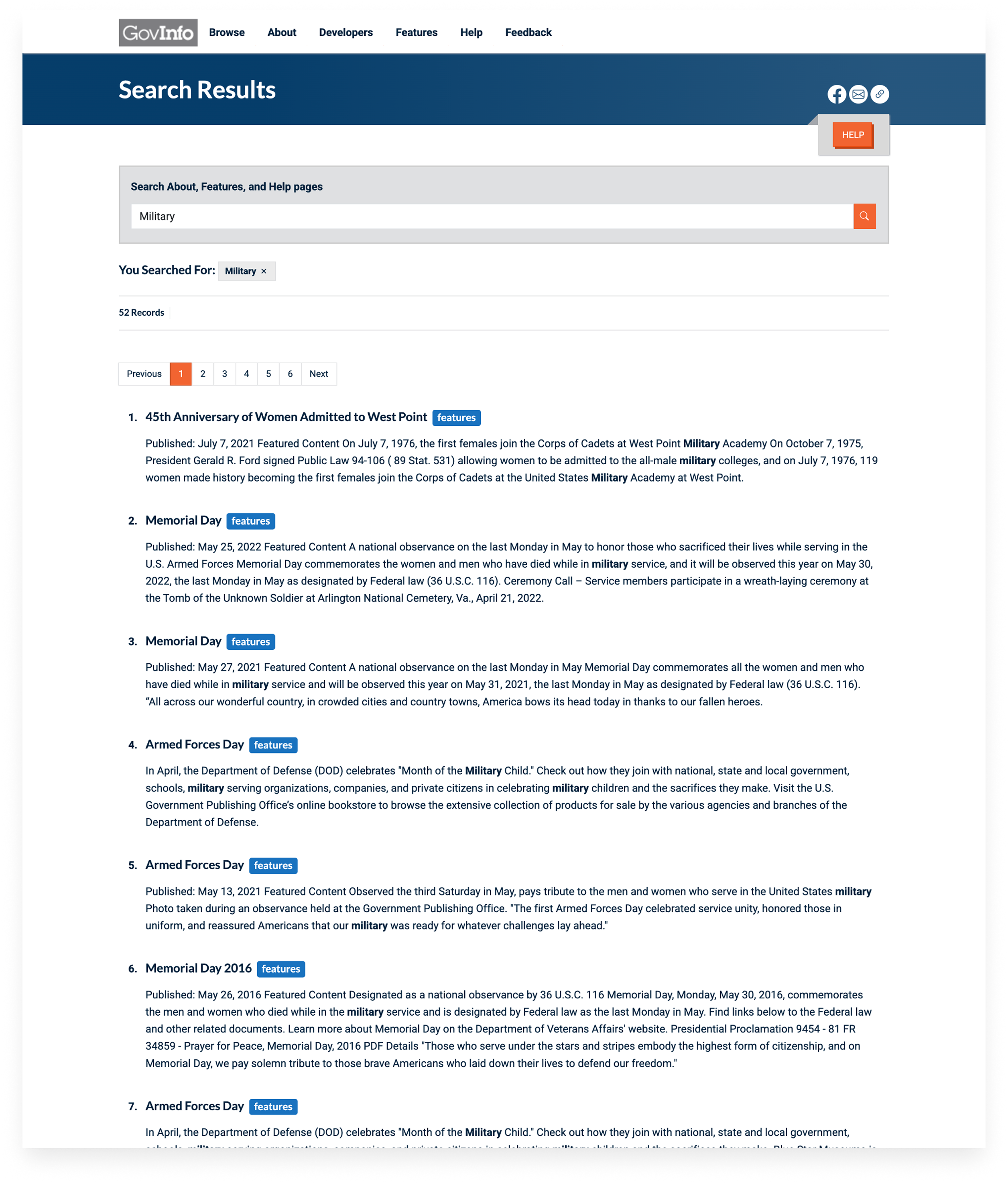
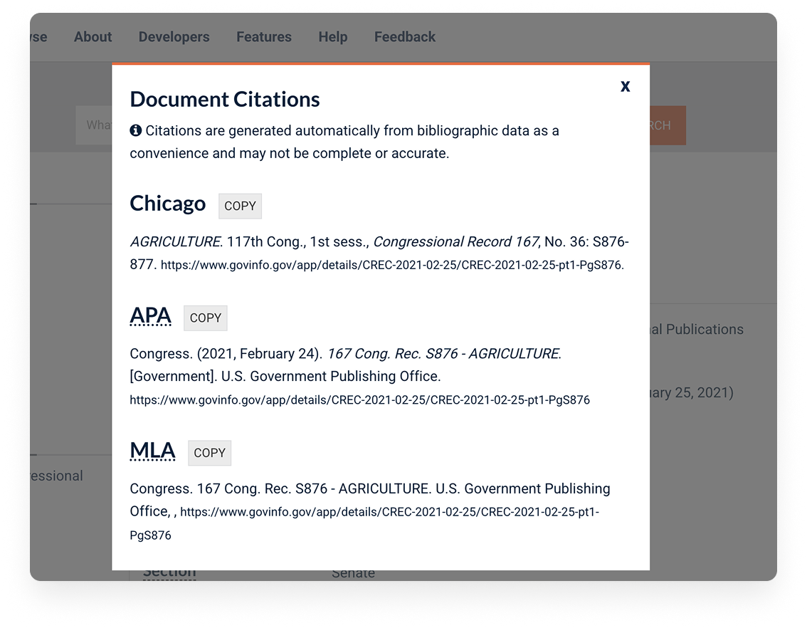
Identified for must-haves: more robust and improved metadata, a citation tool for our librarian and researcher users, and more documentation for their re-usable Backbone.js component library.
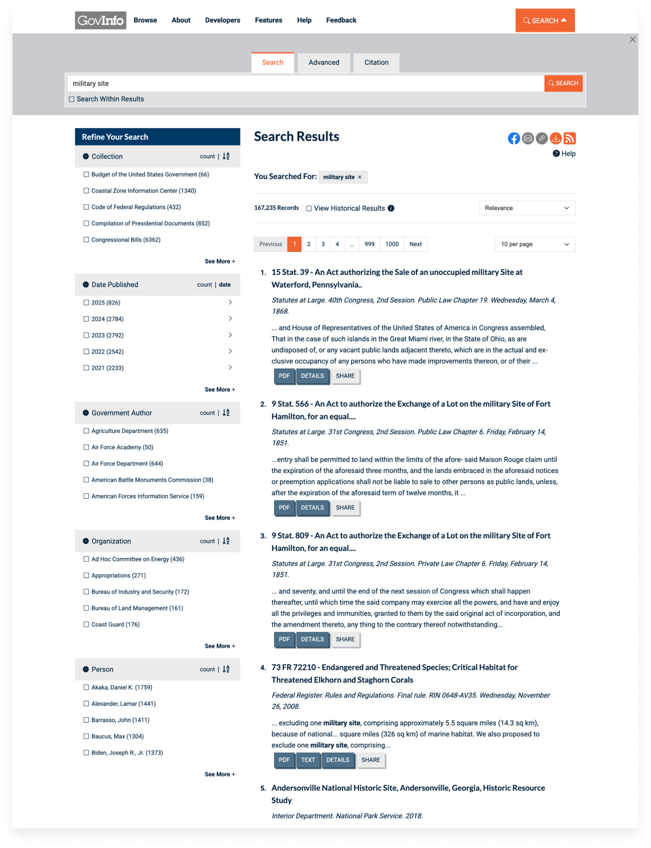
The site’s responsive design, such as the typographic system and how search features showed up on smaller screens, needed a designer’s eye to be more balanced.
I did an audit to find accessibility problems and the site needed a lot of changes to meet set government compliance.
Feature Brainstorming and Ideation
Each sprint I had a session with rough wireframing for new features and diagrams. I reviewed backlog items with user feedback to get a feel for how users searched within the system.
I learned more about how librarians and researchers utilized the system’s APIs and metadata, which would inform the new citation tools and search improvements.
I also experimented with some emerging patterns and standards from the U.S. Web Design system after it had started reaching product maturity.
Findings
While they didn’t want to utilize the USWDS components yet, enhancements could follow in the spirit of it.
Users couldn’t find Govinfo content through organic search and there was no easy way to generate citations.
Typography, more responsive navigation menus, verification modals, and smooth animation sequences for interactive elements would help in the modernization effort.
Design and Development
I did interactive prototypes to help federal clients have more of a vision for product enhancements.
After getting sign off it was up to me to collaborate with the technical folks to write Backbone.js code. I focused not only on the design cohesion, but also Section 508 accessibility which hadn’t been part of development considerations before. From there, I built a new citation tool that pulled page metadata to generate formatted citations, and added more modern metadata formats in the application for site crawlers.
I became well integrated with the engineering team and sought out for my design expertise and front-end development knowledge, bridging the gaps and becoming indispensable for the client.
Findings
The development ecosystem had to be considered in design choices. The codebase was large and making changes to the UI had many downstream effects that had to be accounted for during sprint time allocations.
They didn’t have a style guide or library to pull from, so I spearheaded creating documentation in Fractal.js, a front-end design style guide system, to show what changes were being made and their impacts on other components. This got their entire branding and design system into one place for better analysis.
By the end of my time on the project, the team finally had one design system shared across two products, and this made it easier to keep choices straight for future enhancements as well as uniform components to pull from.